Data visualization isn’t just about creating attractive charts or graphics—it’s about transforming complex data into clear, intuitive visuals that highlight key insights and support effective decision-making. Good visualization simplifies information, focuses attention on what matters most, and enhances the story we are telling through our reports and presentations.
Good data visualization enhances the story that we are telling with our reports and presentations.
We integrate data visualizations into all stages of our research process to make findings more accessible, interpretable, and actionable for a wide range of audiences.
Data Dashboards and Mapping
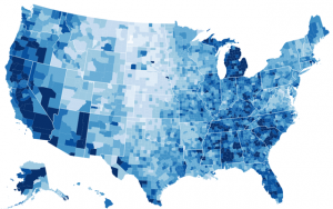
MDR uses tools like Tableau to build interactive dashboards and custom maps that help clients explore their data dynamically. These visualizations allow users to examine trends, filter by key variables, and identify patterns not easily visible in static tables or reports.
Our dashboards support data integration from multiple sources and can be connected to real-time analytics platforms. With built-in geographic information system (GIS) capabilities, we develop tailored mapping solutions that reveal regional differences and help uncover place-based disparities—powerful tools for guiding policy, allocating resources, and designing targeted interventions.
Dashboards can be securely shared with stakeholders to create a collaborative, data-informed environment for decision-making.
Infographics
To make complex information more digestible for broad audiences, MDR designs custom infographics using Canva. These compelling, visually engaging graphics distill data into clear messages that highlight key findings and support storytelling.
Infographics are ideal for sharing research highlights with community partners, decision-makers, or the public—particularly when time or attention is limited. Whether included in reports, distributed as standalone briefs, or shared via social media, our infographics help turn data into stories that resonate.
MDR’s approach to data visualization is grounded in clarity, purpose, and impact—always with the goal of making data easier to understand and use. From interactive dashboards to concise infographics, we equip our clients with the tools they need to communicate insights effectively and confidently.